The Iterative States of America
In a political era defined by dysfunction, can design play a role in engaging voters—and even help them believe in democracy again?
Design for politics almost never involves graphics that satisfy serious consumers of visual culture. Presidential candidates, for example, have famously awful logos, clichéd variations on waving American flags, sometimes emphasizing the stars and sometimes the stripes. One noteworthy exception emerged in the 2008 presidential campaign: Barack Obama’s O, at once a symbol of the man, a depiction of Middle America’s agrarian self-image, and a sunny message of hope. Fifteen years later that O, the product of a Chicago branding firm, Sender, is still impossible to equal.
Design that is effective politically is not necessarily design that is pleasing to the cognoscenti. Trump’s Make America Great Again hat, for example, was largely written off as a craven imitation of a Mack Trucks or John Deere cap. It was so transparently a rich guy’s attempt to appeal to the masses that it should have backfired. Instead, it was a key component in a winning campaign and the rare piece of campaign paraphernalia that has become, it seems, a permanent part of the culture.
Meanwhile, Hillary Clinton’s 2016 logo, a thick arrow incorporated into a sans serif H, rigorously thought through and painstakingly designed by Pentagram partner Michael Bierut, was an attempt to make a familiar candidate appear “fresh and compelling.” But the arrow, which was supposed to be pointing toward the future, failed to propel her there.
Somewhere in between the neo-populism of the red hat and the cool professionalism of the arrow were posters by the design firm Tandem for Alexandra Ocasio-Cortez’s 2018 congressional bid. In the bilingual placard, they used her portrait surrounded by bold, angled type and “Ocasio” punctuated by Spanish-style exclamation marks (one inverted and the other upright). The overall effect was to emphasize her multicultural identity and make the candidate appear mythic—a matador, a revolutionary, an operatic heroine—rather than just a former bartender running for a congressional seat in Queens.
This iconography was an example of political design hitting the sweet spot, packaging AOC in a way that telegraphed her lack of political experience and transformed a liability into not just an asset, but a marketable image. The New York Times labeled her much imitated campaign graphics—especially the angled type—as “a new graphical language for progressivism.”
That alchemy is exactly what political design is supposed to do. It’s supposed to distill candidates, complex human beings, into a few simple, galvanizing attributes and turn citizens—often preoccupied or indifferent—into voters. Ideally, they should be engaged voters who are willing to do everything they can to get past the hurdles that certain state and local governments have lately put in their way. This transformation doesn’t happen in any predictable way and certainly not in a progression that adheres to anyone’s rules about the formal qualities of visual language. Even at the best of times, what might be viewed as good design in another context, doesn’t guarantee success in politics.
And this is not the best of times. We are at a perilous moment in which one of our two major political parties is working with some success to dismantle democracy and its institutions, to game the system so that a majority of voters can never prevail again. The niceties we routinely think of as design problems, the choice of a typeface on a bumper sticker or the fine art of distilling a complex policy idea into a single word or icon, are dwarfed by a much bigger design problem: the political system itself.
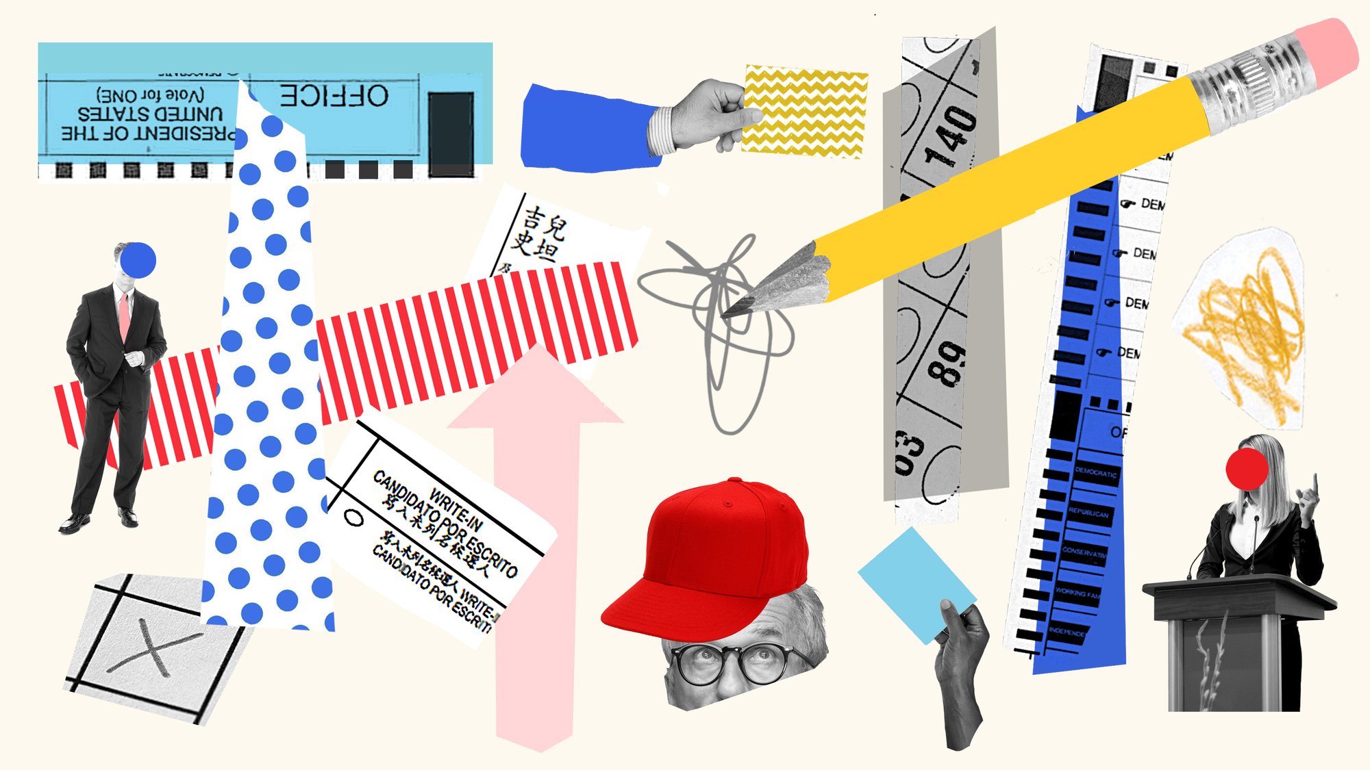
Democracy demands at least two kinds of design. There are campaign graphics—bumper stickers, yard signs, TV ads—intended to call attention to voters and engage them on a candidate or an issue. And then there are all the forms, procedures, and devices that allow us to register, cast a ballot, and ensure that ballot is counted. And, at the moment, this less obvious form of design—the mechanics of the system—is particularly crucial.
And our mechanics are a little peculiar. For instance, one oddity of our version of democracy is that it’s the outgrowth of a disagreement among our founding designers about how much power should be given to a central government and how much to the various states. What emerged was a set of compromises. Our Senate, for instance, with two senators per state, was conceived to give each state an equal share of power, but two-and-a-half centuries later, the difference in magnitude between California (pop. 39.5 million) and Wyoming (pop. 578,803) is not something that even the most farsighted founders could have imagined.
However, the founders’ most innovative design solution, the Electoral College, was crafted as an end run around a direct election of a president by the people. In part this was because the framers, those legendary paragons of democracy, didn’t exactly trust the judgment of the people. Also, it allowed the southern states to leverage their non-voting slave populations into political clout; electoral votes were allotted on the basis of a state’s population and each slave was counted as 3/5 of a person. In short, the Electoral College was a work of design, one that embodied extraordinary injustice and still perpetuates the mixed motives of its designers.
“I’m still inclined to call it an experiment,” says Ashleigh Axios, speaking about our particular approach to democracy. Axios is the chief experience officer of the Washington, DC–based design firm Coforma, a digital services agency with the motto “Where progress is designed.” She observes, “It’s an experiment that needs a lot of iteration.”
Iteration, of course, is the favorite word of many technologically inclined designers like Axios. Formerly a creative director of digital strategy in the Obama White House, she now focuses on projects that try to improve the day-to-day workings of democracy, in particular the ways that federal agencies interface with the public they serve.
Asked what design could do to save and rehabilitate a 21st-century democratic system invented by 18th-century men who were way more conflicted about their grand project than most of us ever realized, Axios replies, “We tend to think about our democracy as this fixed and beautiful system that others should aspire to. But I hope that now people are seeing some of the flaws in the system.”
The flaws, she insists, are correctable because the framers wanted us to iterate. After all, what was the Bill of Rights, but a ten-pack of iterations? Axios suggests that user experience (UX) designers in particular “could be beneficial to this overall experiment that we’re doing.”
At the moment, the less obvious form of design that democracy requires—the mechanics of the system—is particularly crucial.
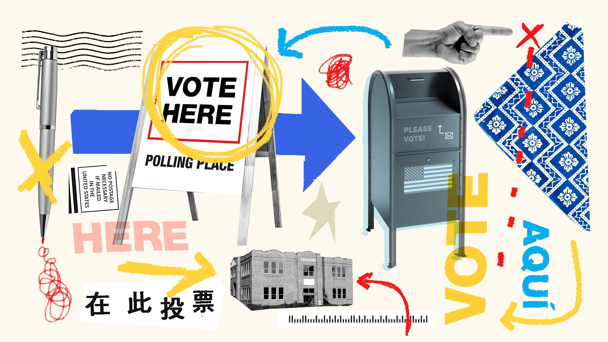
Although much of what we deal with in our daily lives—banking, booking flights, dating—has been rethought and streamlined in recent years by UX designers, it seems strange to think about the pillar of our democracy as a tech-driven design project. But what is voting but the generation, collection, and analysis of data? A sophisticated UX-driven approach—one that also tackles security issues—makes perfect sense for elections and their associated logistics.
In truth, UX thinking has been gradually reshaping our election systems since 2000, the year Al Gore won the popular vote by over half a million but lost the Electoral College to George W. Bush by 537 votes, largely because of the horrendous ballot design in Palm Beach County, Florida.
Since 2000, ballot design has been a favorite subject of organizations like the American Institute of Graphic Arts (AIGA), the Brennan Center for Justice, and, in the past decade, the Center for Civic Design. If you visit the last organization’s website, you’ll find an array of Field Guides covering pretty much every aspect of voting. They are remarkably simple documents, each exuding a clarity of purpose and an adherence to functionalism that puts the Bauhaus to shame. Volume 1: Designing Usable Ballots is based in part on work the AIGA did on the “nitty-gritty” of effective election design. Instructions are ultra-clear: “Use big enough type.” Or “Pick one sans-serif font.”
The Maryland-based center was founded in 2013 by Dana Chisnell and Whitney Quesenbery, both of whom started out as commercial UX designers. Their motto: “Democracy is a design problem.” Chisnell explains, “We wanted to make it easier for election administrators to deliver a good voter experience. To us, a good voter experience meant that people could vote the way they intended and that their votes were counted as they cast.”
Straightforward, right? But not in the United States, where every state, and often each county and municipality, has its own approach to running elections. The Center’s other guides offer a corrective and include Volume 4: Effective Poll Worker Materials and Volume 8: Guiding Voters through the Polling Place. One of the most recent is Volume 104: Designing Vote at Home Envelopes and Materials. The website also contains an assortment of projects from all over the country intended to clarify and make rational every aspect of the voting process.
Chisnell tells me the single most reassuring thing I’ve heard in a long, long time about U.S. elections: “So much had been done in the previous 20 years after Bush v. Gore to professionalize election administration, so much work by thousands of people over 20 years got us to a place where … the results are true, accurate, secure.”
Executive Director Quesenbery concurs that, despite assertions and primal screams to the contrary, the 2020 election went remarkably well; Americans voted and their votes were accurately counted. “In elections, there’s a saying, which is ‘one day we’ll do a perfect election and no one will notice.’ And that’s essentially what happened in 2020. The primaries were a little rugged between COVID and everything else. I think everybody used that as a wake-up call and pulled together.”
As an example, Quesenbery mentions a successful campaign in Pennsylvania to remind people that absentee ballots wouldn’t be counted unless they were sealed in two envelopes, an outer mailing envelope and an inner secrecy envelope. Ballots mailed without the inner envelopes were referred to as “naked.”
“We helped them make some posters that were very simple cartoons of how to pack your ballot,” says Quesenbery, speaking of work her team did with the Pennsylvania Secretary of State’s office. Then the campaign took on a life of its own. “Random people on social media would make funny little memes” about naked ballots. Then a get-out-the-vote coalition “hired local artists to make gorgeous posters about it. And they funded community groups to get them up on the street corners.” As a result, very few absentee ballots had to be discarded.
The Center for Civic Design had a hand in two recent projects that exemplify the UX approach to improving democracy. Both are notable for their ambition and the range of designers who played a part in them. One involved the first overhaul of Los Angeles County’s election system since 1968. Begun in 2009, the project was completed in time for the 2020 election. Known as the Voting Solutions for All People (VSAP) project, it was intended to make voting easier for everyone, especially those with disabilities.
Aspects of the revamp include an extended early in-person voting period, acceptance of ballots that were mailed as late as election day, and vote centers across Los Angeles where anyone who is registered can vote, regardless of where in the county they live—meaning voters could no longer be turned away for showing up at the wrong polling place.
Quesenbery describes the new ballot and tabulation system as a remarkably simple one in which “everything there is there for a purpose.” The fonts are big enough so that most people can read it. The screens are positioned so voters can reach them from a wheelchair. The voting equipment is “designed to be sturdy, but not too heavy” and to pack efficiently into a warehouse. Quesenbery notes that while everything is computerized, the ballots are paper: “You mark your ballot at all the voting centers, you mark the ballot on a screen, it prints a paper ballot. That’s what’s cast.”
We tend to think about our democracy as this fixed and beautiful system that others should aspire to. I hope that now people are seeing the flaws in the system.
Ashleigh Axios
Chief Experience Officer
Coforma
The Center for Civic Design was also one of several consultants that worked on an outreach project with the New York City Campaign Finance Board, the agency that runs the city’s campaign finance system and oversees the money raised and spent by the candidates. The idea was to attract and educate voters and also to ease New York City’s 2021 introduction of ranked choice voting, in which voters can create a list of preferred candidates for an office instead of choosing just one.
The centerpiece of this project is a website crafted by a team including members from the New York City office of the design firm Pentagram, along with consultants from Blue State, a politically oriented advertising and branding agency, and Big Duck, a communications firm that specializes in non-profits.
The in-house team at the Campaign Finance Board also worked on the project. Winnie Ng, the CFB’s in-house art director, explains that the goal was, in part, to establish a new, public-facing identity for the CFB called NYC Votes: “We were better able to capture the youth audience than we were by using ‘Campaign Finance Board,’” which, she acknowledges, “just sounded very intimidating.”
The NYC Votes logo, designed by Pentagram partner Eddie Opara and his team, is rendered in rugged capital letters with oddly-carved white spaces that look like they were whittled out by hand. New Yorkers, Ng points out, “see ourselves as very edgy, very modern. Very cool. We needed to find a word-mark that matched that personality.”
The site also promotes “inclusivity” with a speech bubble motif—the idea, says Eddie Opara, is to represent “the multitude of voices”—and it provides voters with all the information they need to cast a ballot. If you input your address into a search function, you can find out who’s on your ballot (a detail that is crucial in the wake of recent redistricting) and what the candidates say about their platforms. Non-voters visiting the site can learn how to become voters.
Ng mentions that her own parents, Chinese-speaking immigrants, have a hard time grasping the political system in their adopted city and homeland, so she felt that in working on the NYC Votes site, she was doing something that might be important to them. In fact, her mother-in-law asked her questions about a particular political office. “My Chinese isn’t good enough to talk about local politics,” Ng explains. “I was like, ‘Well, we have a website here. It’s translated. Let me show it to you.’ And she spent a long time on it. She was like, ‘Wow, this was so helpful.’”
Opara views the site as a symbolic pushback against efforts to suppress minority voters elsewhere in the country and a corrective to the sometimes-daunting complexity of voting in this country. Opara, who is originally from England, observes, “There seems to be this idea in the United States of ‘Let’s create as much confusion about the democratic elements that deal with government as possible.’”
Another one of the site’s creators, Julianna Egner, a vice president of project management and accounts at Blue State, sees it as a tool to help people navigate the complexity of ranked choice ballots, but also as an aid to thinking through more ordinary elections. She especially likes the feature that helps voters plan their ballots by making a shopping list of preferred candidates, something they can take with them to their polling place.
When it comes to elections, Egner believes everyone needs all the help they can get: “I think the basics of democracy are the challenge, right? There’s nothing straightforward or simple about how a democracy works. There’s nothing straightforward about when we vote, how we vote, the fact that districts change every 10 years. Even people who do this work for a living can’t keep track of it.”
Yes, there are still people doing spirited, sometimes inspired, campaign design. Robyn Kanner, proprietor of Studio Gradients, for instance, has made a valiant effort to give the Democratic National Committee a Nike-inspired makeover (“My thought was like what if the candidate was the shoe?” she says). And, yes, campaign designers still crank out door hangers and yard signs. Even plain old analog artifacts can take on new resonance with the aid of social media. ”During the 2012 Obama reelection campaign and the 2019 Democratic primaries with Warren, we saw that people put signs in their yards and then Instagrammed them,” recalls Blue State executive creative director Matt Ipcar talking about yard signs.
But some problems just can’t be fixed by designers, even those well-versed in user experience. Or, rather, they need to be re-designed by people who don’t exactly see themselves as designers.
For example, we really do need to get rid of the Electoral College, with its taint of slavery, its ability to award the presidency to candidates who lost the popular vote, and its unfortunate tendency to undervalue the votes of those in the most populous states. However, the system is enshrined in the Constitution and would require a Constitutional amendment to get rid of it.
So, an unusually bipartisan group of senators are currently working on the Electoral Count Reform and Presidential Transition Improvement Act of 2022, a revision of the Electoral Count Act of 1887 that would eliminate the gray areas that former President Trump and allies tried to exploit on January 6, 2021. The reformed act would clearly state that the vice president’s role in counting the electoral votes is purely ceremonial and ensure that state lawmakers can’t overturn a state’s popular vote. The senators involved should, in this instance, be viewed as designers who understand, as Axios does, that our democratic experiment periodically needs to be iterated forward. ❤
Writer and educator Karrie Jacobs is a professional observer of the manmade landscape. Her recent writing has appeared in Curbed, the New York Times, and the MIT Technology Review.
Andrea D’Aquino is an illustrator whose work appears regularly online and in print for many clients internationally. She is the author and illustrator of A Life Made by Hand: The Story of Ruth Asawa, a children’s picture book biography, among others.
At Kazam! Magazine we believe design has the power to change the world. Our stories feature people, projects, and ideas that are shaping a better tomorrow.